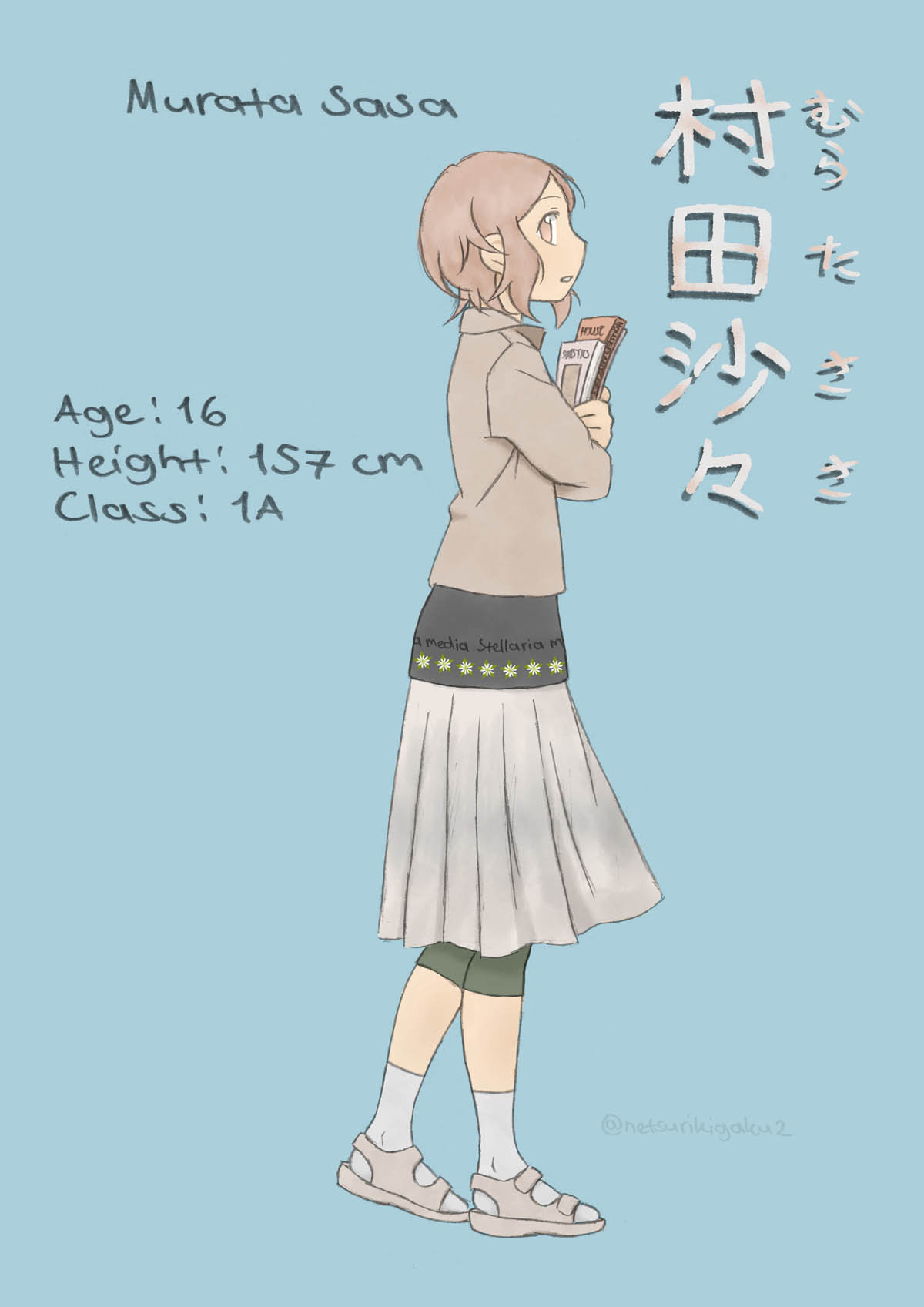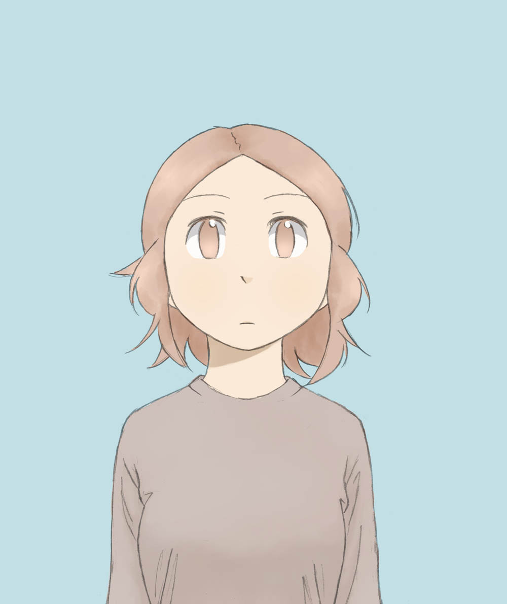
 Sasa has also her own – somewhat shortish – introduction blog post here.

I… should have planned where to place the horizontal text before deciding on the rest of the layout. (There just wasn’t enough space left anywhere after I had finished the drawing. So the text ended up being a bit too far on the left.) (EDIT 24.11.2018: This is the original introduction drawing. I’m still quite fond of it, so I’ll just leave it here…)
