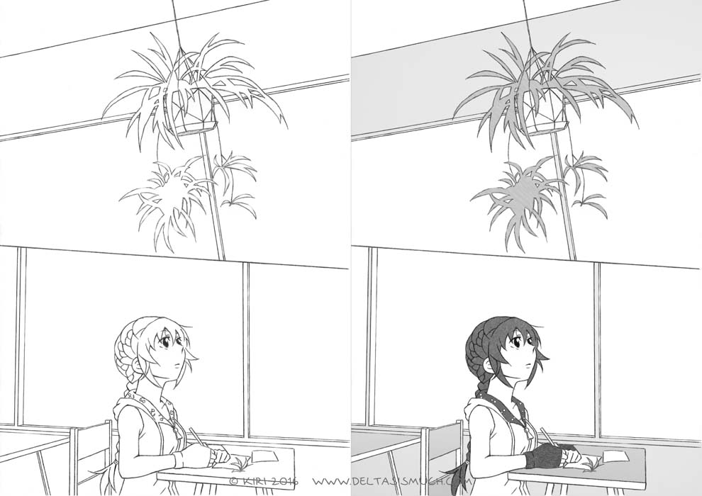
I recently…

… tried changing the style of my drawings. (Though chances are that no one notices, as the style is constantly changing anyway.) And I’m still in the process of developing it, because I’m not yet quite content with how the drawings look like.

… updated the Characters page. (Meaning there are now a total of three character introductions…) The drawings will be monochrome until I get better at coloring.

I also changed (or rather, “updated”) the header image. You can consider it a demonstration of my current coloring skills. Finishing the drawing in question took me several hours.

***

As a side note of a side note, I’m planning to write at least two series of blog posts around particular topics. I’ll describe them in more detail during next week.

A blog post…

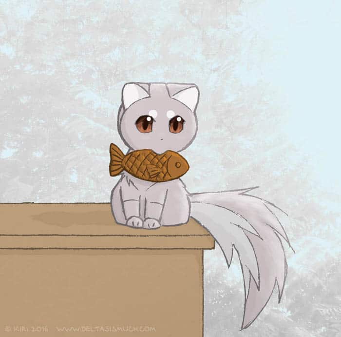
Taiyaki_-_blogi_-_dS_20160721

… as an excuse to upload the above drawing also onto this site.
I don’t really have anything to say about it, though.

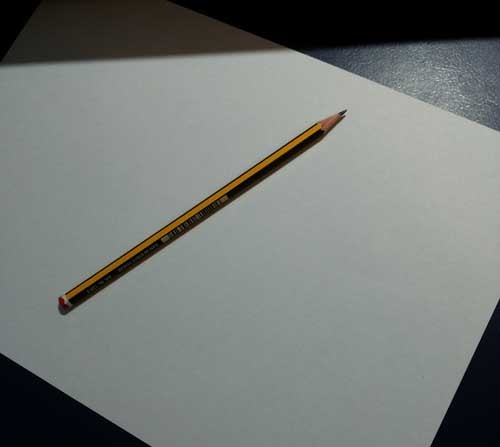
And as I haven’t been receiving new ideas regarding topics for blog posts, I’m going to use the one I was suggested earlier during this summer: a photo of the equipment I use for drawing this webcomic.

So here you are:

pencil_-_webcomic_dS_20160822

Joking aside, I’m travelling again – meaning I don’t have light table etc. (which I admittedly should have included in that photo) with me, so the update of the webcomic will be postponed about a week or so. (Please bear with me. ^_^;)

I might write another blog post though, if I come up with a topic good enough. And in case you find reading my blog posts boring and would rather look at pictures, here are a few drawings I recently made while pracing how to draw yukata. I’m still updating this collection at the time of writing this post. There will probably be nine images in total (or more, if those RTs and likes keep increasing).

As always, comments and questions are welcome!

PS. Actually, I have a question. Which one of these would you prefer:
1) somewhat less polished look on the webcomic + more frequent updates, or
2) the way it currently is?
I’m bit on the fence about this myself, so it would be nice to hear other’s opinion too.

On the workflow of the pages of “ΔS”>>

Travelling again. So a blog post instead of webcomic this week. (Please bear with me. ^_^;) In addition I’m finally going to update the Characters page of the website later this week. Look forward to it if you have been annoyed by the “nothing here yet” text.

As some people have suggested me that it could be a good topic for a blog post, I’ll write about the typical workflow of a page of “ΔS”>>. (Only on a general level, though, and focusing on the steps done with computer; otherwise the post would become quite long.)

In short, this post is mostly about flatting (as well as the steps before and after it). It isn’t anything I have come up with by myself, neither is the workflow described below meant to be a tutorial of any kind. (You may regard it as such if you want, but there are other, better tutorials out there. Like this and this one.) This is just a description of how I work.

Without further ado, to the actual blog post:

The general workflow of a page after drawing it

1) Scanning and resizing the page
The original paper size is A4. After scanning it (600 dpi) I change the size to A5.

2) Cleaning up the line drawing; adjusting brightness and levels; lettering
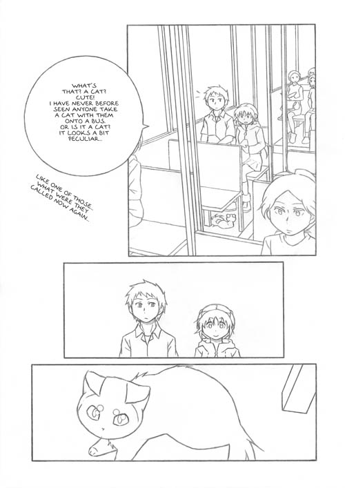
Mode: Grayscale Resolution: 600 dpi Number of layers: Usually one, more while writing text

Mode: Grayscale
Resolution: 600 dpi
Number of layers: Usually one, more while writing text

For lettering I use a font that I made myself. (In the Japanese version, however, I use MS Mincho and occasionally MS Gothic, as well as hand-written text.)

3) Flatting
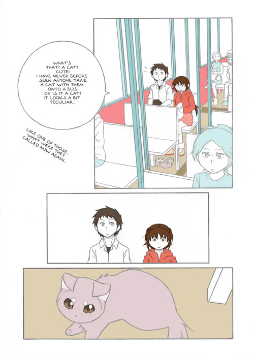
Mode: RGB Resolution: 300 dpi Number of layers: Usually three (one for colors, one for the line drawings, one for additional lines), sometimes more

Mode: RGB
Resolution: 300 dpi
Number of layers: Usually three (one for colors, one for the line drawings, one for additional lines), sometimes more

The color layer is beneath all the other ones, and the line drawing layer above it is set to “multiply”. It doesn’t really matter what colors are used, as long as they are distinct, since their only function is to make selection of areas easier. (It’s not like I’d ever use that kind of colors for bus interior…)
This step usually takes a lot of time.

4) Colors-only version of the page
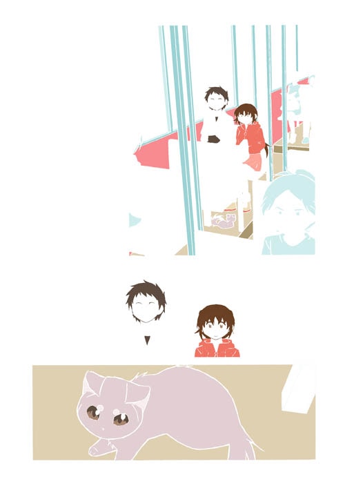
Mode: RGB Resolution: 600 dpi Number of layers: One

Mode: RGB
Resolution: 600 dpi
Number of layers: One

5) Adding gray textures
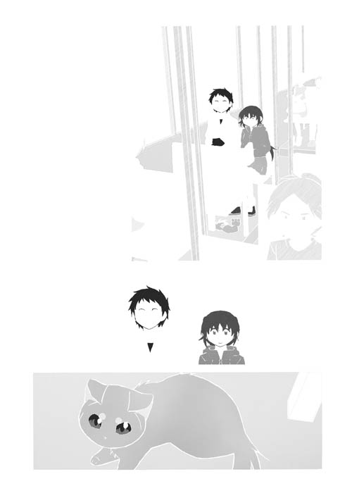
Mode: RGB at first, grayscale at the end Resolution: 600 dpi Number of layers: One initially, several while working, one again at the end

Mode: RGB at first, grayscale at the end
Resolution: 600 dpi
Number of layers: One initially, several while working, one again at the end

Copy-pasting gray textures into the colored surfaces.

6) The final version
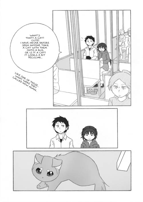
Mode: Grayscale Resolution: 600 dpi Number of layers: First two, then one

Mode: Grayscale
Resolution: 600 dpi
Number of layers: First two, then one

Here the line drawing from step 1 is combined with the gray textures from step 4: I start by copying the gray textures layer and placing it beneath the line drawing, after which I set the line drawing layer to multiply. (This is by far the nicest part of the whole working process.) If the page looks ok, I flatten the image into a single layer.

***

Just a random thought that occurred to me a while ago: If there are people who find their way here through search engines, they are most likely looking for something thermodynamics-related information instead of a webcomic that… at this point probably appears to be about falling spider plant plantlets, or something along those lines?  ^_^;  (It isn’t… Or, well, I guess it depends on the way you look at it.)

Screentones (again)

(Though I really should stop calling them screentones before someone gets angry at me for misuse of the term.)

First off, I’m travelling for a while, and since I don’t carry a scanner, light table or graphics tablet with me there will be a longer-than-usual break before the next update of the comic. The following pages will probably be finished and uploaded here by next week’s Sunday (29th of May).

I can, however, write even if I don’t have a scanner at hand, so this time I’ll compose a blog post instead. (Not that I’d think this makes up for the postponed update of the comic.)

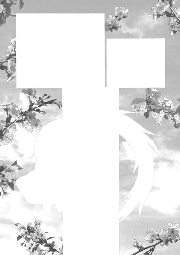
grayscale clouds and flowering branches

Flowering brances. Either cherry or apple trees. Not sure. I have taken plenty of photos of both. (I probably should be able to tell them apart by looking at this image, but… Oh well, it doesn’t really matter which ones they are.)

The background of page 5 of the first chapter. Of all the pages I’ve drawn so far, this might be the easiest one to write about. The workflow for it was as follows: (1) designing the layout of the page (already a few years ago); (2) taking lots of photographs of flowering branches and sky (over the years); (3) selecting and cropping a few of the photos (this was somewhat tedious); (4) drawing the page; and (5) adjusting the size, angle and tones of the branches. It took a lot of time to finish the page, but I think it was worth it, as I’m quite content with the final look of the page. (Though it might look a bit odd when placed next to page 6.) Besides, experimenting with different kinds of screentones gray textures is never boring.

This particular file – the background alone – was huge when I was working on it. By huge I mean something close to 100 megabytes. With high resolution, multiple layers and RGB mode, large file size might not be all that surprising, but it did startle me a bit. (I’m quite sure my computer wasn’t too happy about having to deal with an image that large…)

***

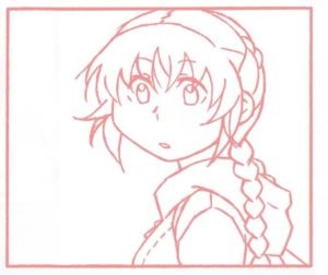
Chapter 1, page 6, panel 2

Just a random panel (from chapter 1, page 6). As a filler.

I’m still trying to figure out what to write about in these blog posts. The webcomic is the main content of this site, but in addition to that I’d like to blog something too, every now and then. Technical aspects seem like a relevant subject here, if not interesting, so for now I have settled on them. But variety would be nice too, and I’m open to suggestions: If there is some topic related to this webcomic you would like me to write about (for example some particular part of the working process), let me know. Questions and comments are more than welcome too.

Screentones

So, at this point I have finished and uploaded twelve pages (three of which are either text-only or totally empty, so maybe I shouldn’t actually count them? Well, nine pages) of the story. Not much, admittedly, but more is to come. And who knows, I might also become faster at drawing when I continue this long enough.

Speaking of getting fast, I probably use too much ”screentones” (or rather, gray textures). And because of that, it takes hours to ”color” even a single page. In theory this should not be too difficult a problem to fix, since all it takes is to leave more areas white. But every time I start coloring the page, my hands just won’t stop…   ^_^;

Is it just me or does this page actually look better without any gray textures?

Is it just me or does this page actually look better without any gray textures?

Snapshot

Building up this website is still very much in progress, and the final look of the site will likely differ quite a lot from the current one.

Anyway, if someone happens to find their way here already, feel free to leave comments and/or questions below.